July 5, 2021
How to create the visual identity of an esports tournament taking inspiration from anime
5 min read
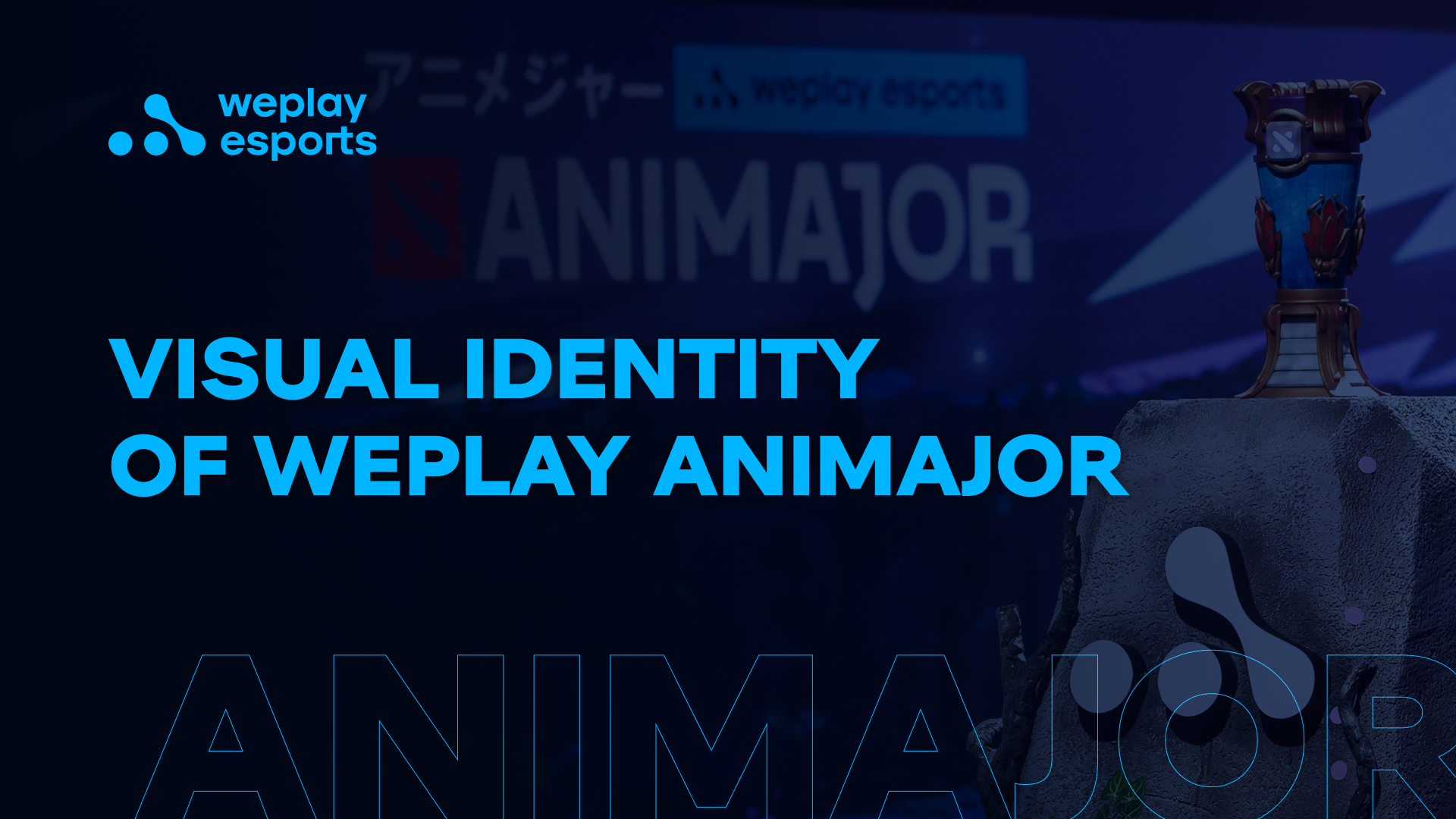
Visual identity of WePlay AniMajor
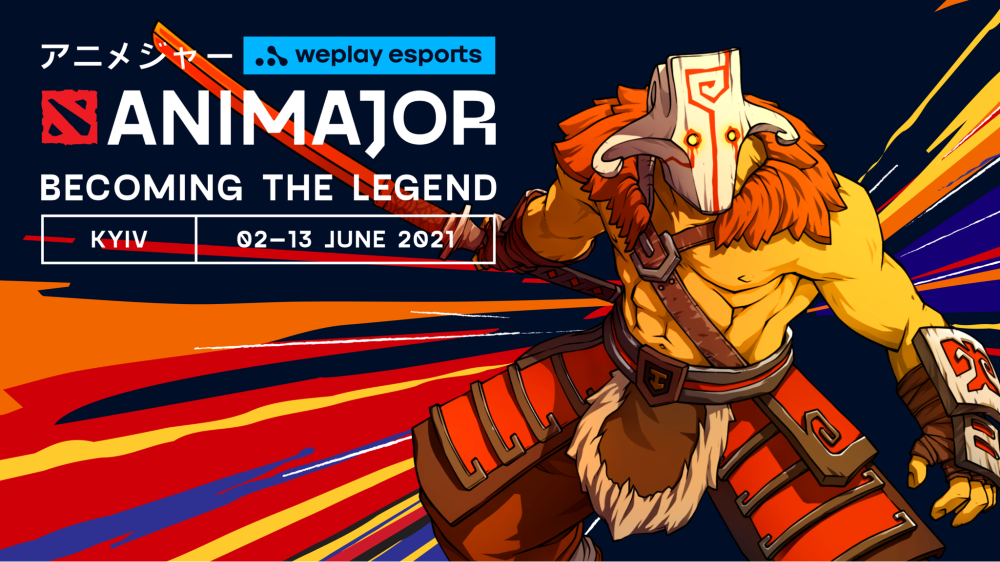
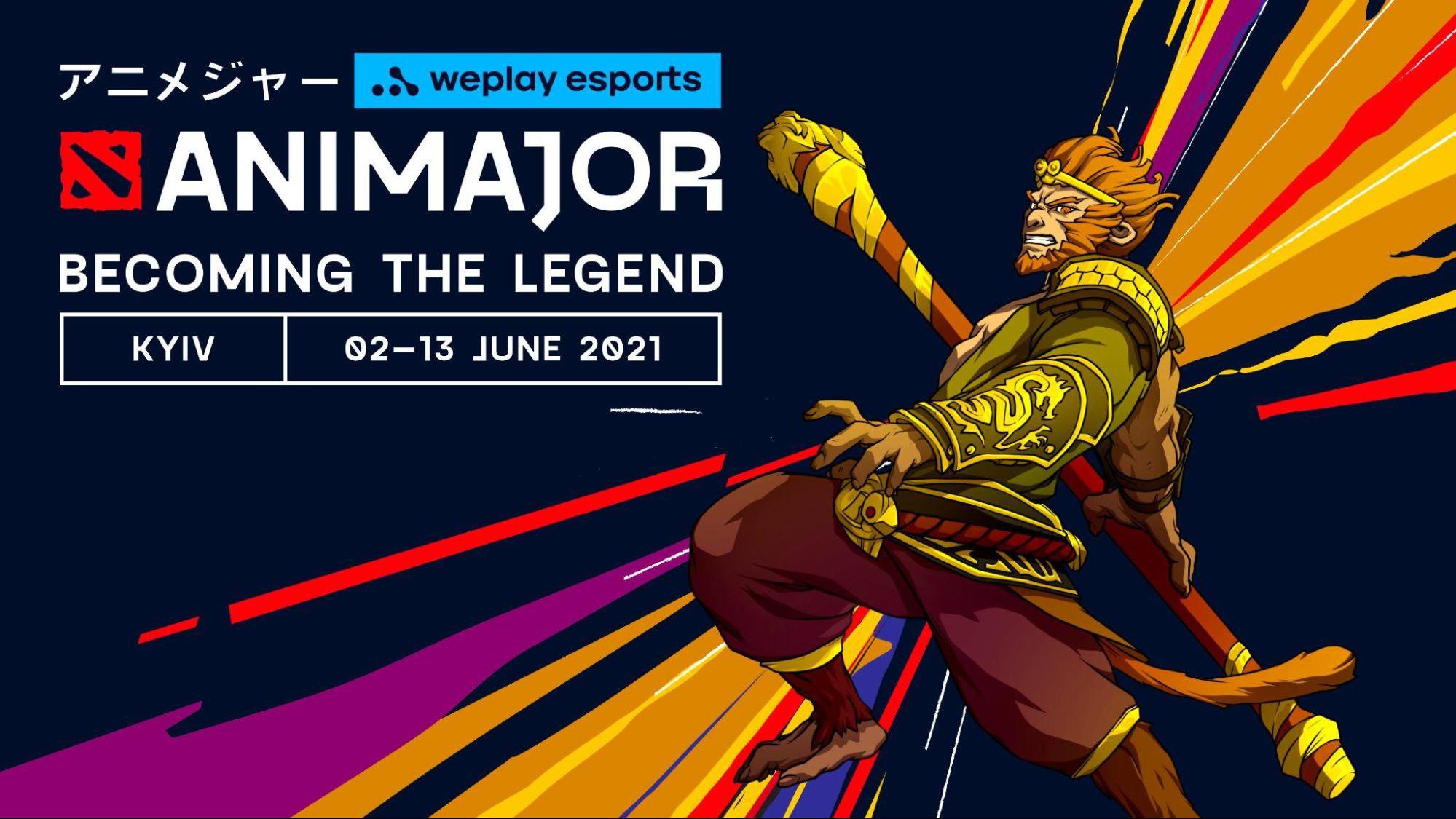
One of the key visuals of WePlay AniMajor. Image: WePlay Holding
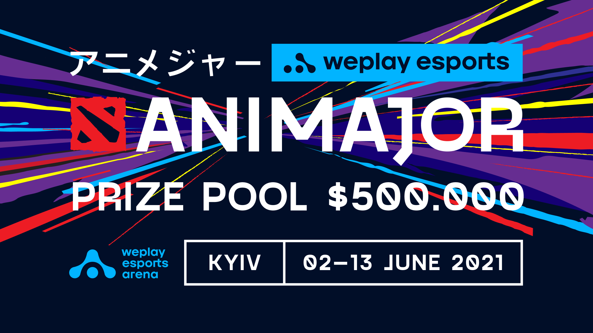
WePlay AniMajor has been one of the most important international Dota 2 tournaments in 2021, with $500,000 and a lot of Dota Pro Circuit (DPC) points on the line. The teams need the points to get an invitation to The International 2021, to be held in Bucharest in October of this year, boasting a prize pool of $40 million.
The idea to hold an event set in the anime world has been in the works for a long time. The vivid style with a lot of easily recognizable elements was perfect for creating a cool visual story: from digital materials to cut-in scenes and set decor. Traditionally, esports and anime have quite an overlap in terms of audience, which was once again confirmed by the DOTA: Dragon’s Blood series released on Netflix in 2021.
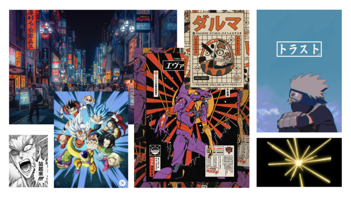
Examples of the Japanese visual culture. Image: Google
On average, WePlay Esports holds six or seven tournaments a year, with each calling for a visual identity of its own. And this is exactly what the WePlay Esports design team is doing. It is responsible for most of the communication materials: from the logos of individual company products to developing a tournament’s visual identity.
In addition to the promo graphics, broadcast graphics are tailor-made for each tournament. They are often different in style from the main concept since they specifically cover broadcast-related needs.
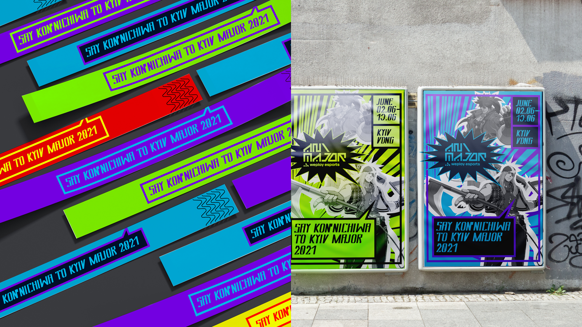
Usually, the process of creating a visual identity works like this: the studio communicates the idea for the upcoming tournament — the setting, the stage, talents’ costumes, etc. Then the team gets to work on developing that idea further. Each designer prepares their own version of the visual identity, after which the team selects the final version that best meets the task requirements. This workflow means that there are several options to choose from, and it’s possible to address several risks at once, as the deadlines for developing a visual style are usually quite tight. Here’s how the WePlay AniMajor visual style could look like:
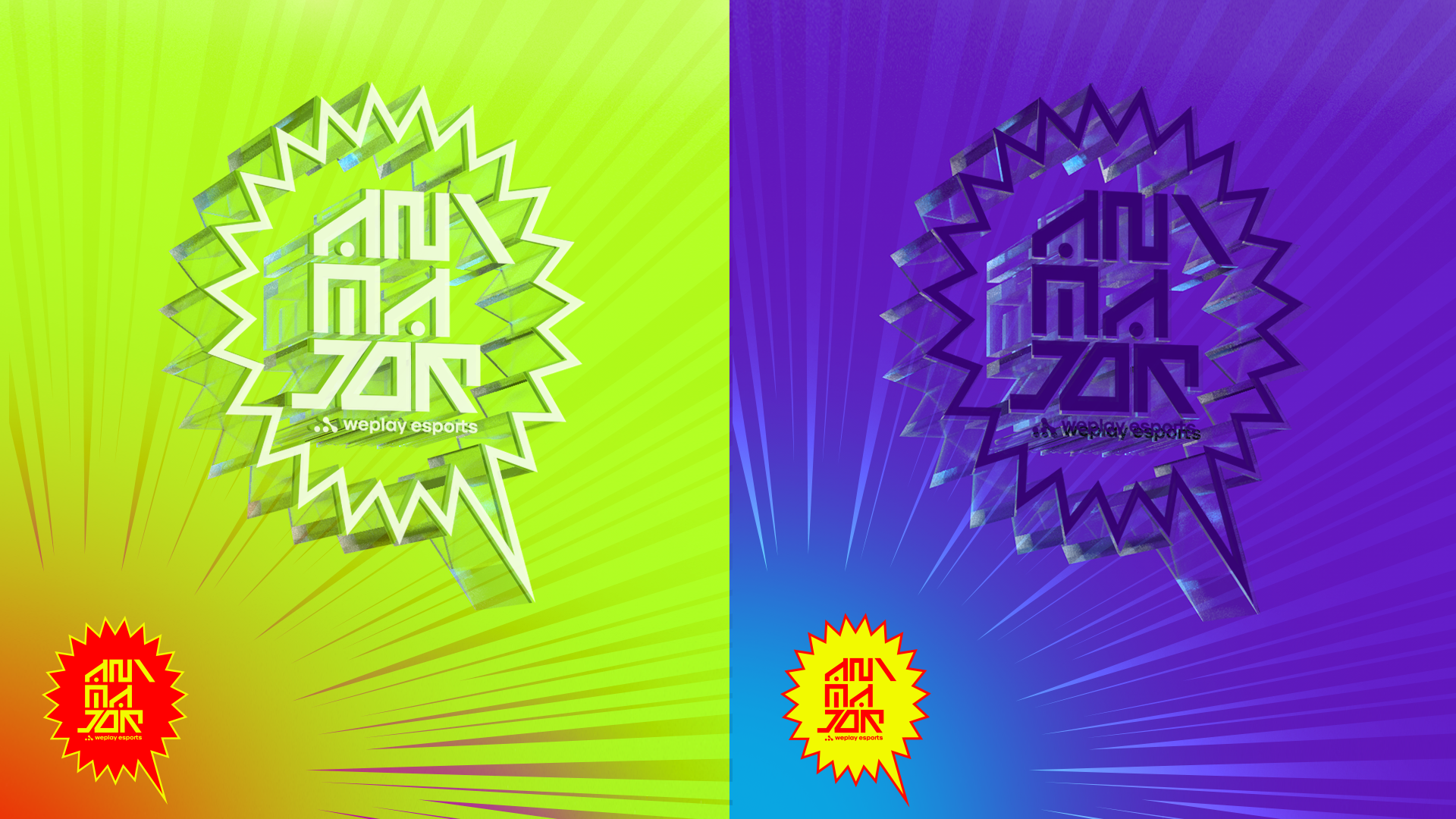
Possible visual design options for WePlay AniMajor. Image: WePlay Holding.
Possible visual design options for WePlay AniMajor. Image: WePlay Holding.
Possible visual design options for WePlay AniMajor. Image: WePlay Holding.
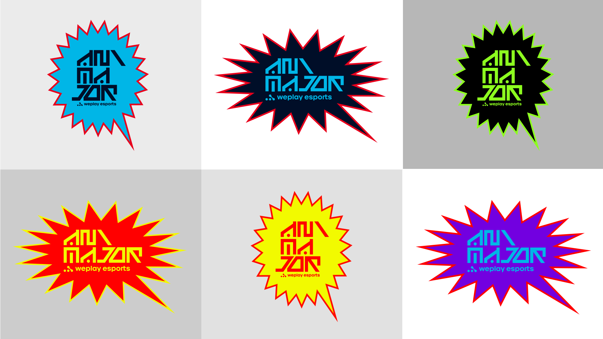
Logo

The WePlay AniMajor logo. Image: WePlay Holding
The logo design consists of the unique AniMajor font, the Dota 2 sign, the WePlay Esports logo, as well as several Japanese characters. The latter represent the name of the tournament and serve to enhance the link with anime.
The identity uses the Gosha Sans font from the Pangram Pangram Foundry studio. The original version of the font was modified to give the logo a “Japanese feel.” Incidentally, it turned out that the guys from the studio are fans of esports events.
Style
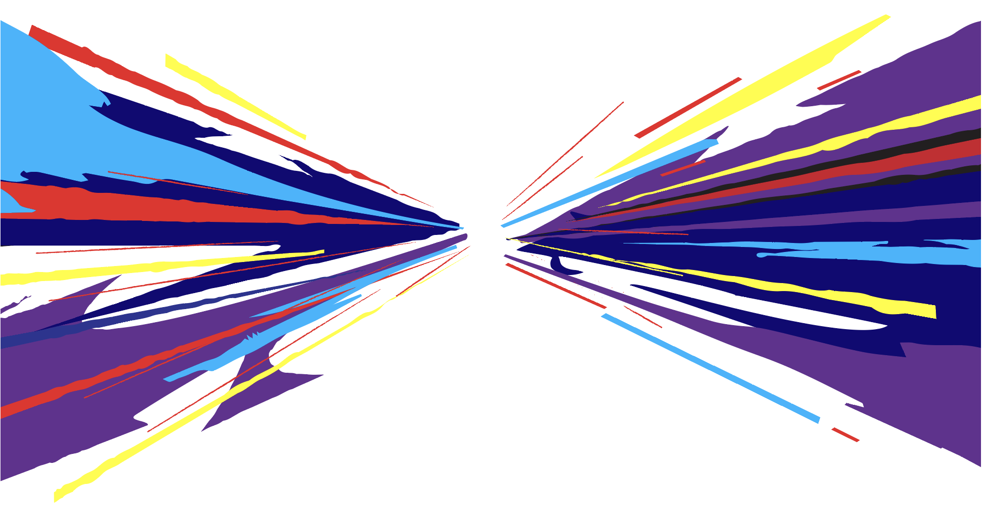
The visual system of WePlay AniMajor is based on the compositional proportions of the main style elements, namely the logo, the font, unique rays, characteristic grid, and also thematic illustrations. Their composition is based on clear rules and visual rhythm.

Main elements of the WePlay AniMajor visual communication. Image: WePlay Holding

Transforming an idea into a finished graphic structure. Image: WePlay Holding
“One of the main elements of the style are the radial rays. This form was not chosen at random. First, it’s a reference to the confrontation between two teams. Second, if you take a look at the letters A and M (the first letters in the words Anime and Major), you can see that the top of the A points upwards, and the joining strokes of the M gravitate downwards. By translating these observations into graphics, we have created the skeleton of the ray structure, ” explains Sergei Gorelov, concept designer at WePlay Esports.
The announcement of a game between two teams at the tournament. Image: WePlay Holding
«Breaking down the information into blocks is widely used in Japanese comic books, signage, advertising modules, and interior design. We have integrated this visual technique into the signature style of WePlay AniMajor,” says Ksenia Babankova, art director at WePlay Esports.
Radial rays. Image: WePlay Holding
The color palette of the tournament was influenced by three key factors: the color of the Dota 2 logo, WePlay Esports’ corporate colors, and the Ukrainian national colors — to emphasize the tournament location, Ukraine. It also contained purple — the color of lotus from the DOTA: Dragon’s Blood anime. It’s dominant in the set decor and the stage.
In the case of WePlay AniMajor, the team created several key visuals, each with its own set of colors, depending on the Dota 2 hero depicted on it.
Key visuals of WePlay AniMajor. Images: WePlay Holding
Key visuals of WePlay AniMajor. Images: WePlay Holding
“Our company’s vision is to make esports a new mainstream culture and a form of entertainment of the future. We want to change the modern esports market since we understand that in some aspects, it is noticeably lagging behind other areas of the entertainment industry.
Design is one of the criteria for which esports is behind “traditional” sports, even though it has significant potential. It’s still heavily influenced by standardized approaches and design clichés typical of big sports. And we are working to shift this balance.
The design team have performed extensive research and identified the elements of anime that fit into the modern design trends. This promo style has already found both its fans and haters, but now we can say with certainty that the design team has succeeded in creating a visual identity that distinguishes WePlay AniMajor from other majors, which was actually the main business objective here, ” notes Vitaliy Ivanenko, chief design officer of WePlay Esports.
(This article has been updated on July 08 after an announcement from Valve regarding a new date and place for The International 2021).