2019
3 min read
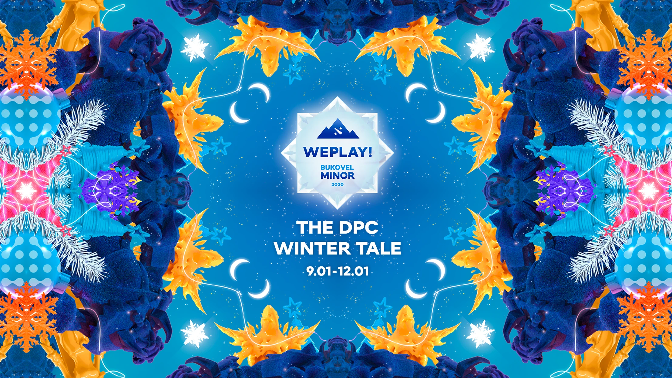
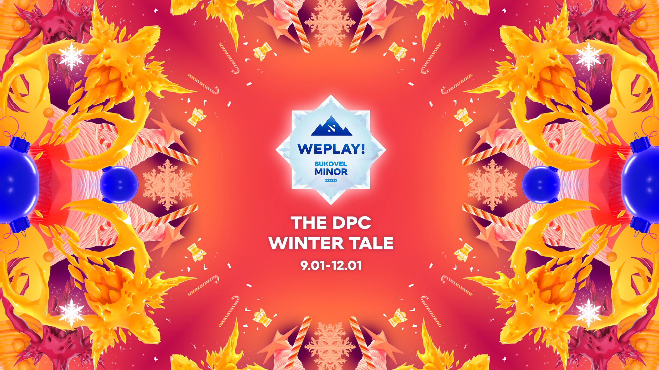
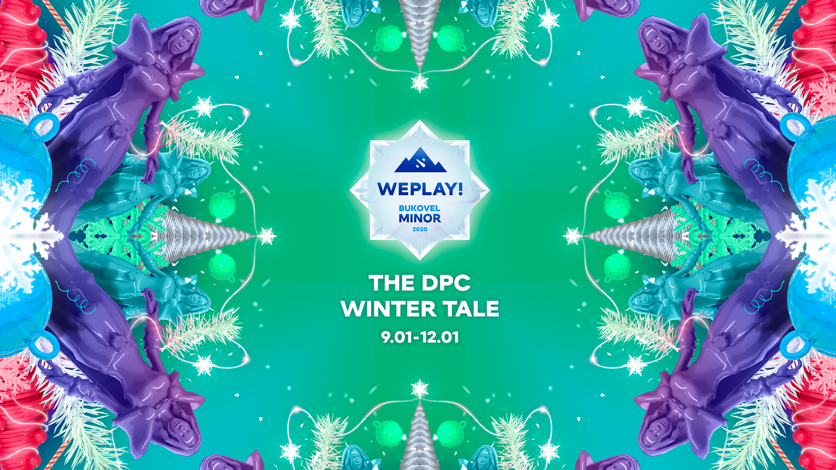
WePlay! Bukovel Minor 2020 emblem and design were developed using the technique called “kaleidoscope.”
The emblem of WePlay! Bukovel Minor 2020 combines elements, associated with Dota 2, the tourist complex “Bukovel,” and the winter fairy-tale theme.
“We were tasked to develop a tournament identity that would combine the tourist complex “Bukovel,” Dota 2, and the studio format of winter fairy-tale. After some debates, the team decided to apply visual techniques called “kaleidoscope,” which facilitates the mixing of various elements in a single design.
We took three winter Dota 2 heroes (Crystal Maiden, Ancient Apparition, and Tusk), various symbols of the winter holidays, and used it all in a kaleidoscope setting” — comments Ksenia Babankova, Art-Director at WePlay! Esports.
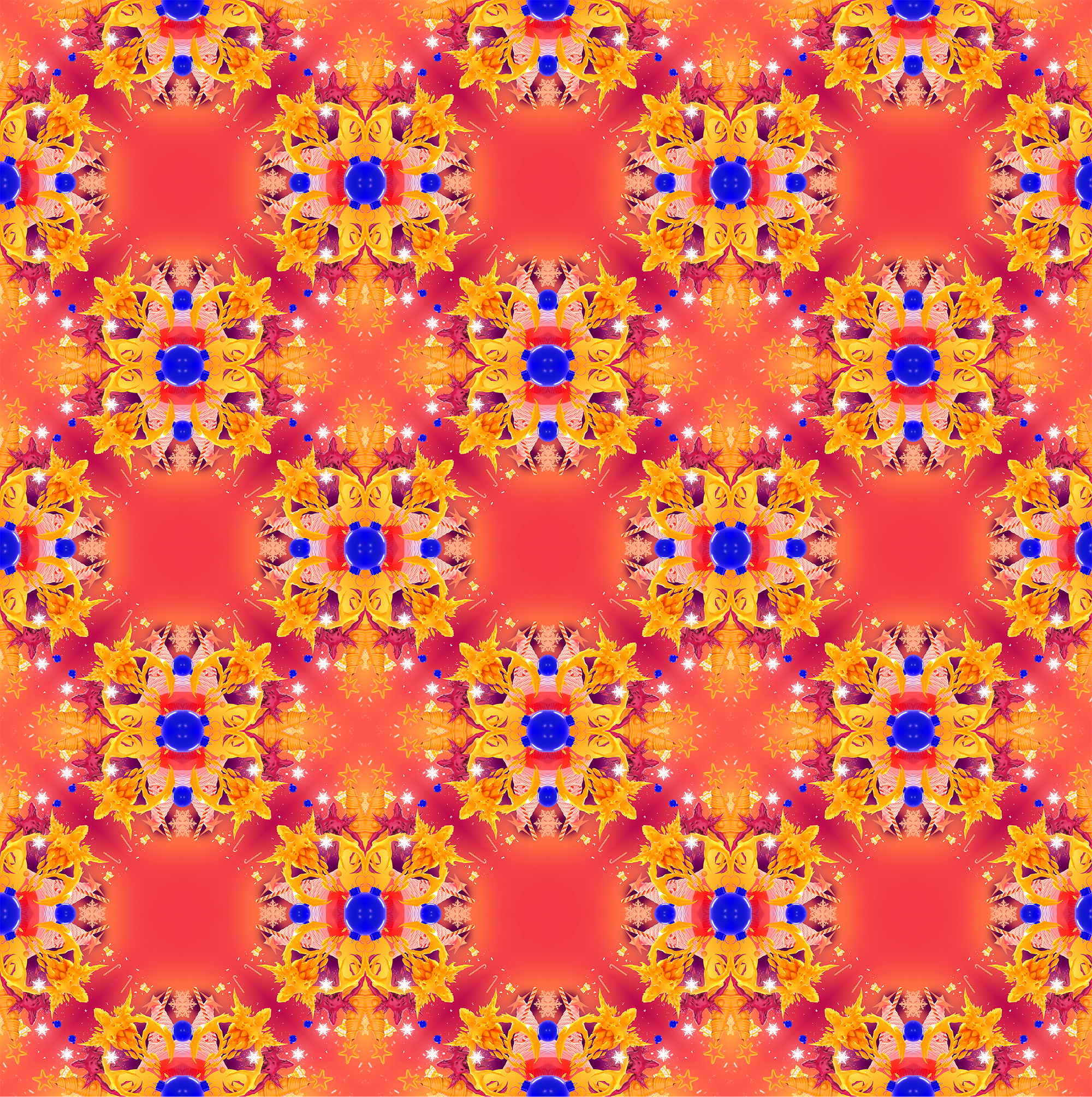
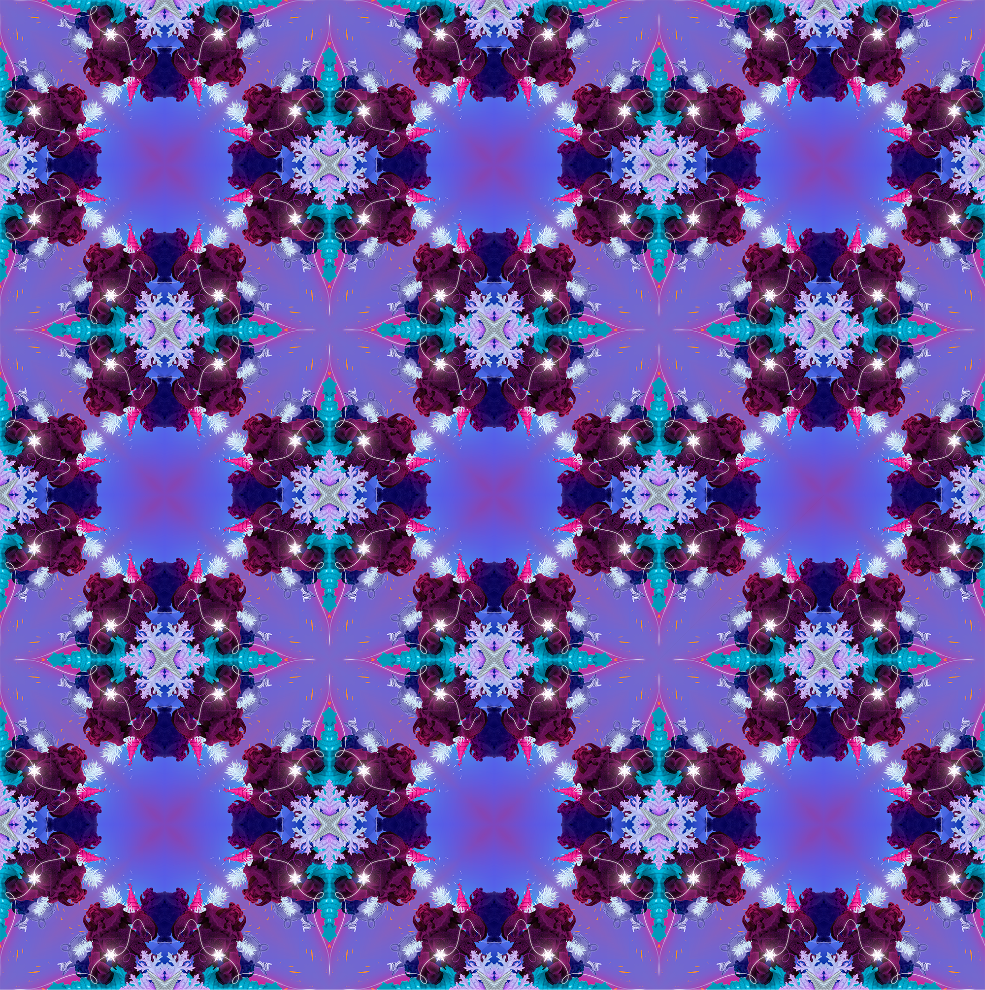
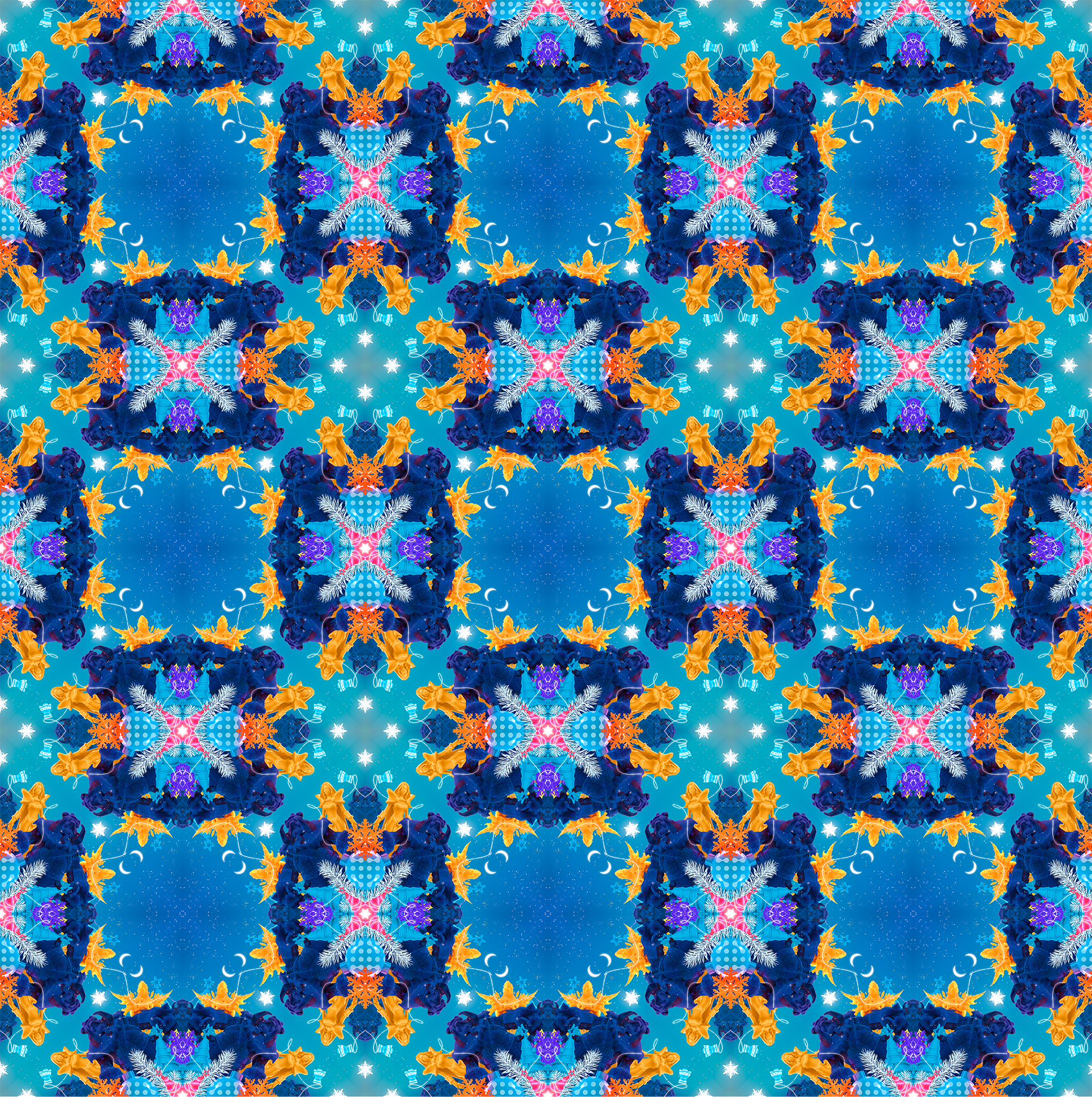
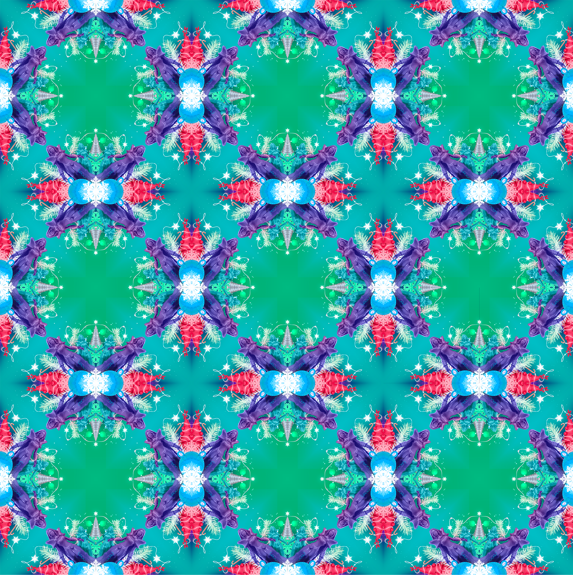
The WePlay! Esports team created four main patterns, that will be used throughout the event:
Image credits to WePlay! Esports Press Office.
“Our task was to develop the style and branding for WePlay! Bukovel Minor 2020, aligned with the company strategy. The result had to conform with the philosophy of our studio that always uses new angles while broadcasting esports competitions.
The previous designs, such as the love-themed Valentine Madness and superagent-themed Lock and Load, received a lot of positive feedback from the audience. In my opinion, the team did a great job with the new project. The visual style of the Minor is unusual for an esports event and will inspire various, sometimes even polar opinions. One thing I’m sure of is that no one will be left indifferent” — notes Ivan Rogovchenko, Chief Design Officer at WePlay! Esports.
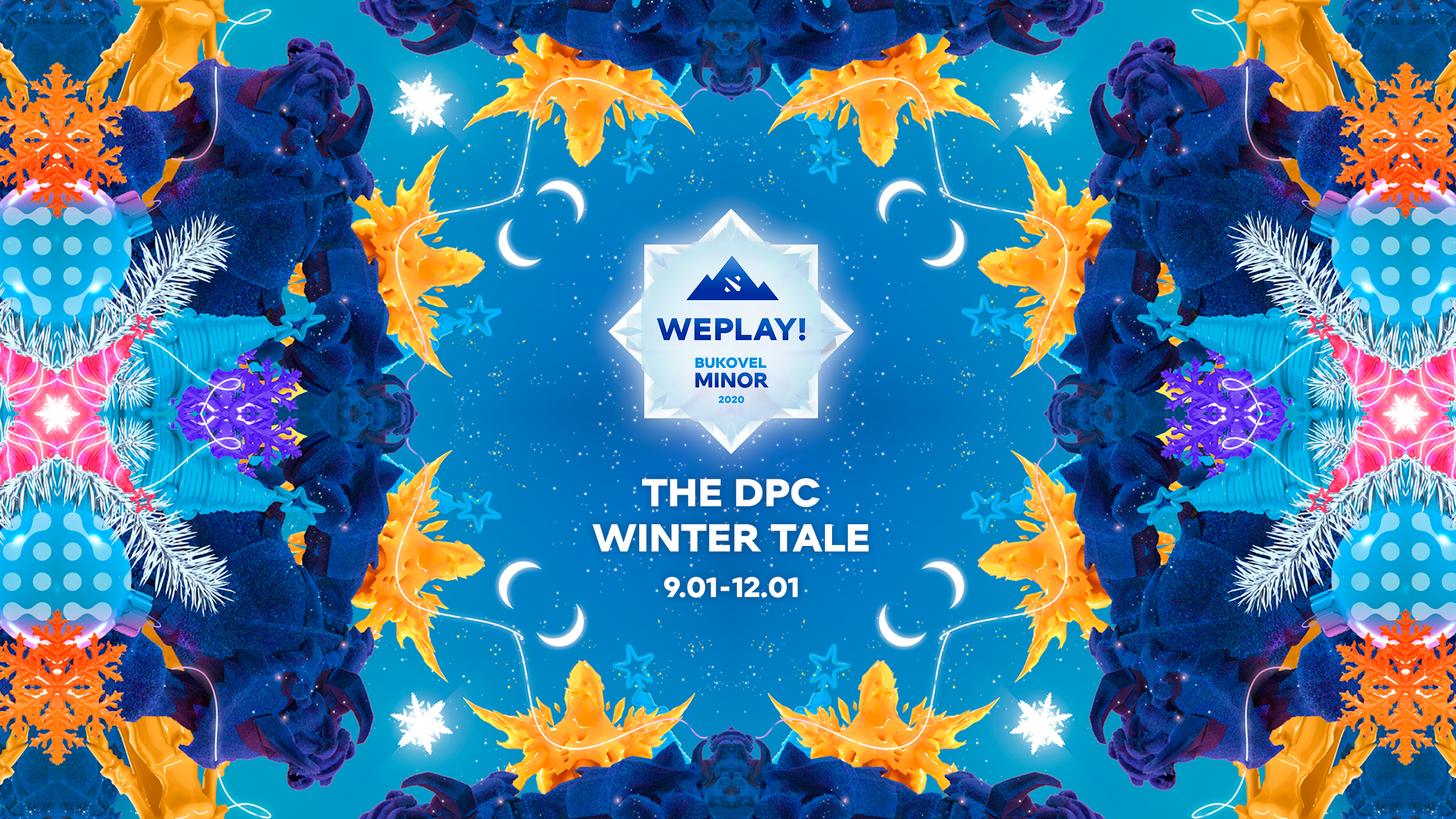
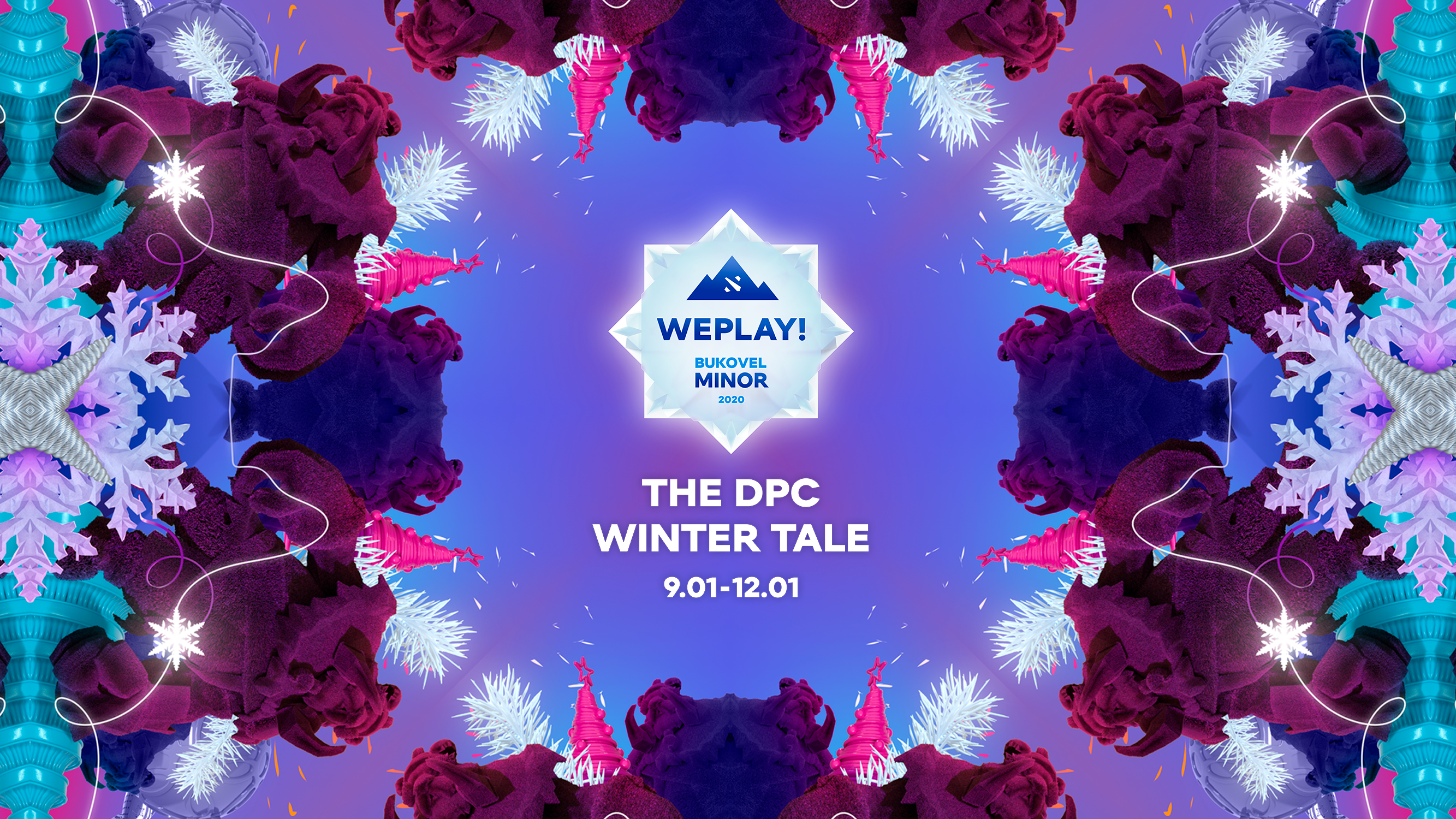
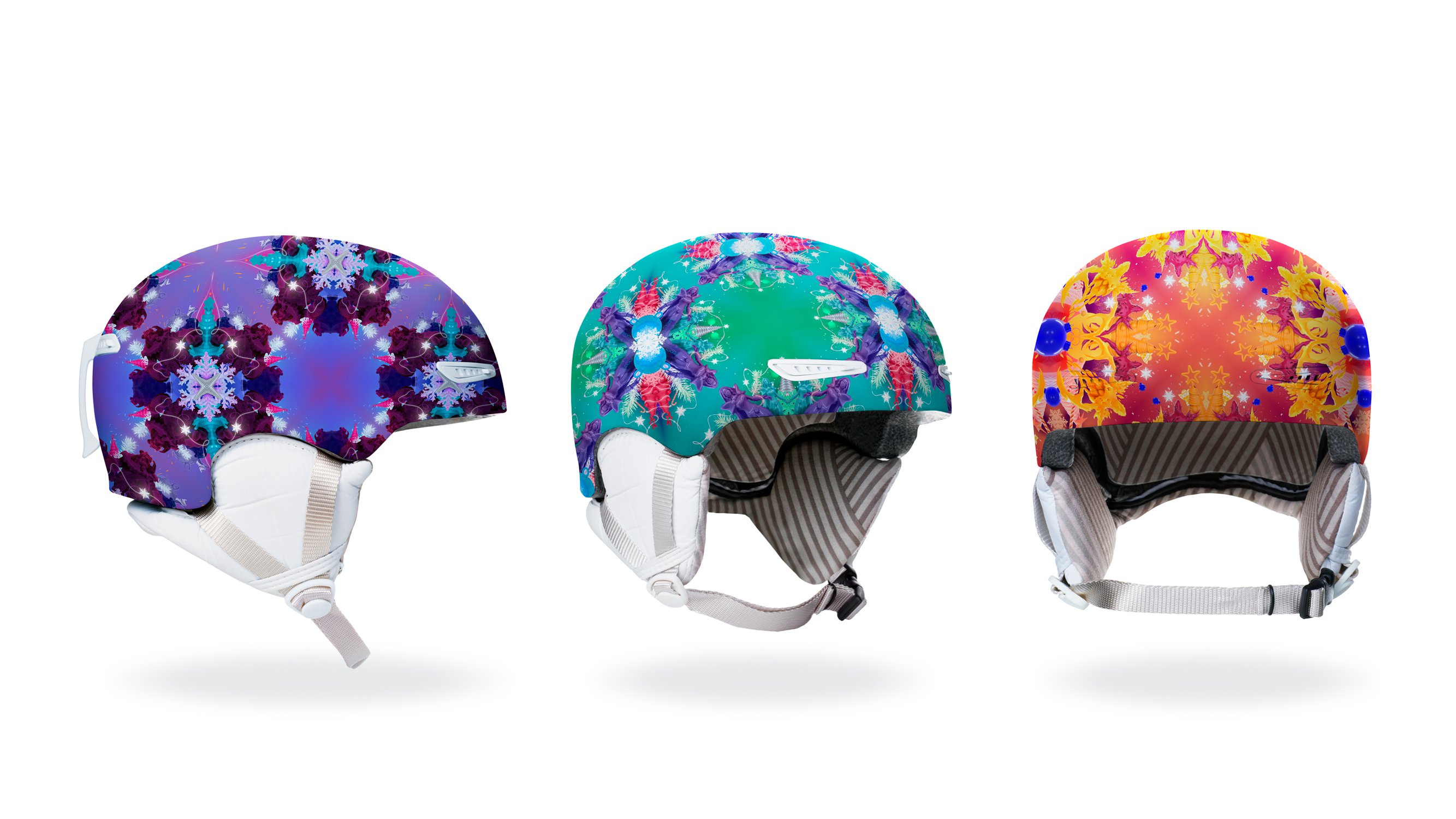
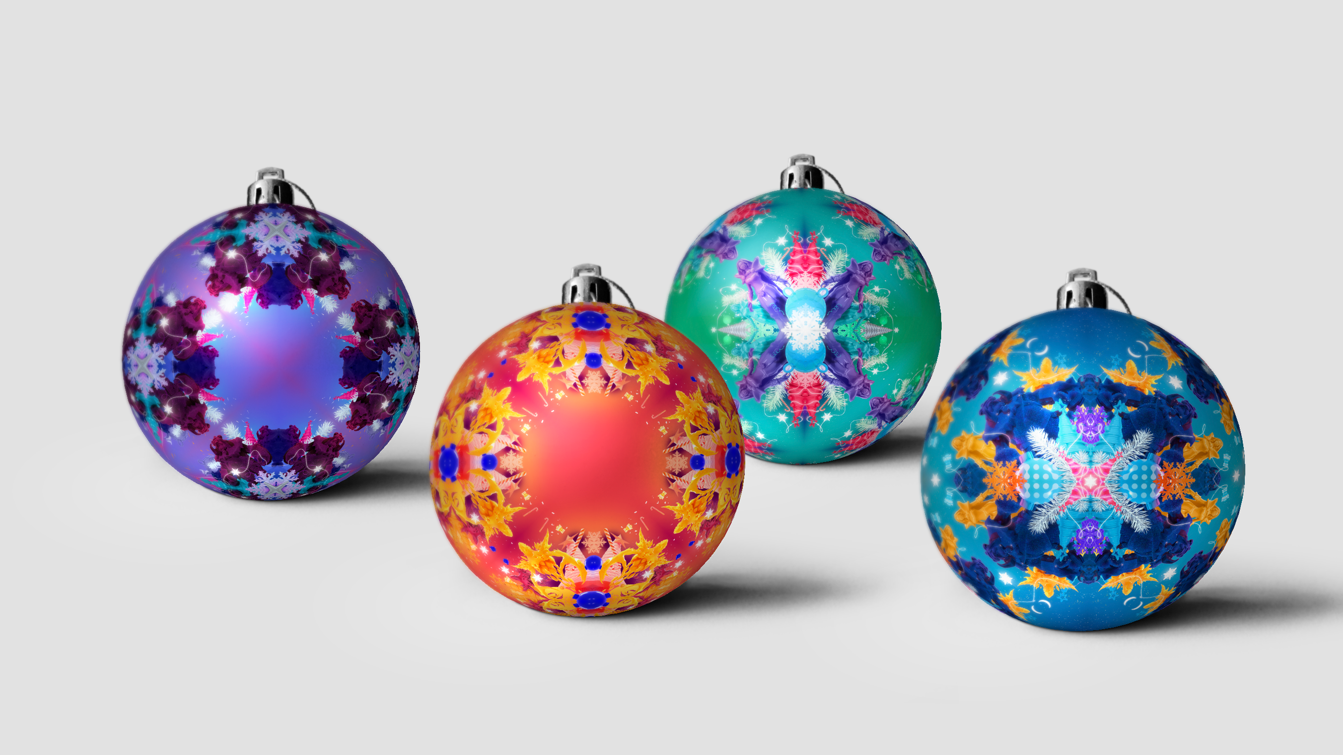
A couple of use cases of the WePlay! Bukovel Minor 2020 visual design:
Contact information for media outlets: press@weplayholding.com
Source: WePlay Holding Press Office
