June 29, 2023
Meet the WePlay Holding design upgrade
3 min read
WePlay Holding stepped into a new era with an upgraded design. The new look reflects its nature, values, and goals. The renewal responds to the holding company’s needs, so let’s begin from the start.
All in good time
WePlay’s story began with a single company focused on organizing esports tournaments. Back then, the company cultivated the esports movement and encouraged people to play. Playing video games is a great way to build relationships, take one’s mind off problems, relax, and have fun. The design became a reflection of the company’s core message at the time.
As things progressed, more companies were born within WePlay Holding. Esports was no longer the sole passion uniting everyone. There were already gaming, show and content production, esports events, data analysis, and much more. So WePlay Holding started thinking about a new look that would better reflect everything it is about.
The process of transformation
As with any major process, the rebranding of WePlay Holding began with an in-depth analysis. The team had to keep in mind what they did at the moment and visualize development prospects. WePlay Holding aims to bring together entertainment, esports, and technology through its innovation strategy with every step. Naturally developing further in the entertainment field, WePlay Holding strives to spread emotions and bring joy to fans worldwide. While operating as a vast mechanism, the company’s values are precision and analysis. The company understands the needs of all customers and looks for ways to satisfy them.
Summing up the results, brand experts concluded that WePlay Holding is like an ongoing festival that always knows exactly what to show its audience. WePlay Holding is about emotions, fun, and… self-expression.
The power of entertainment
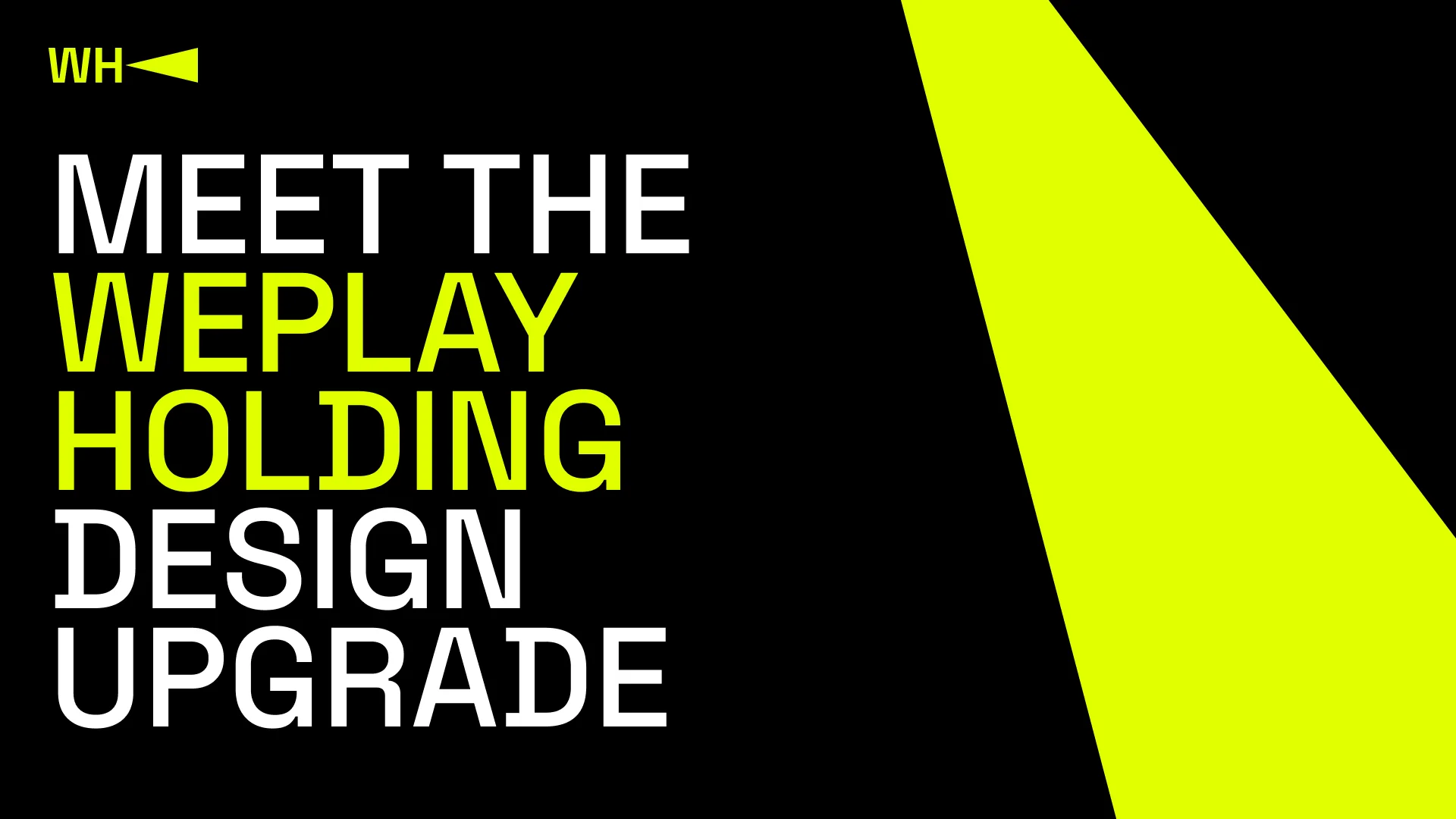
Designers and brand experts translate brand strategy into tangible visual elements, crafting a new logo, color scheme, typography, and other design components. WePlay Holding’s design includes the main aspects of a show. The company’s logo features capital letters accompanied by the beam of a spotlight, which is an element of almost any entertainment show.
WePlay Holding logo. Credit: WePlay Holding
This is the same beam that illuminates the stage and the personalities on it, drives the audience’s attention toward what’s important, and allows them to notice even the most minor details.
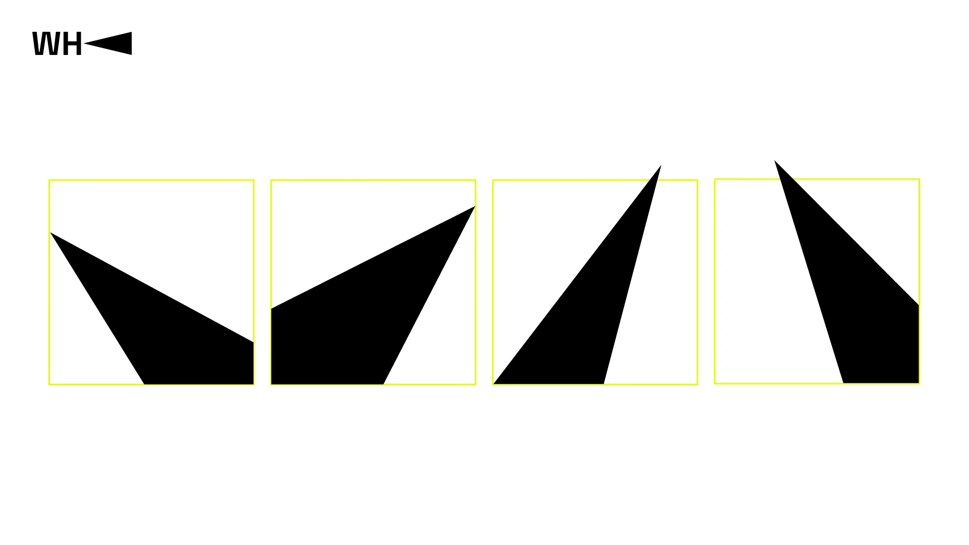
Main elements of WePlay Holding design. Credit: WePlay Holding
The colors used also correspond to those of a show. Black and lemon neon are perfect for a company focused on entertainment and innovation. Lemon neon symbolizes the vibrant light emitted by spotlights, while the black background serves as the foundation for any memorable event.
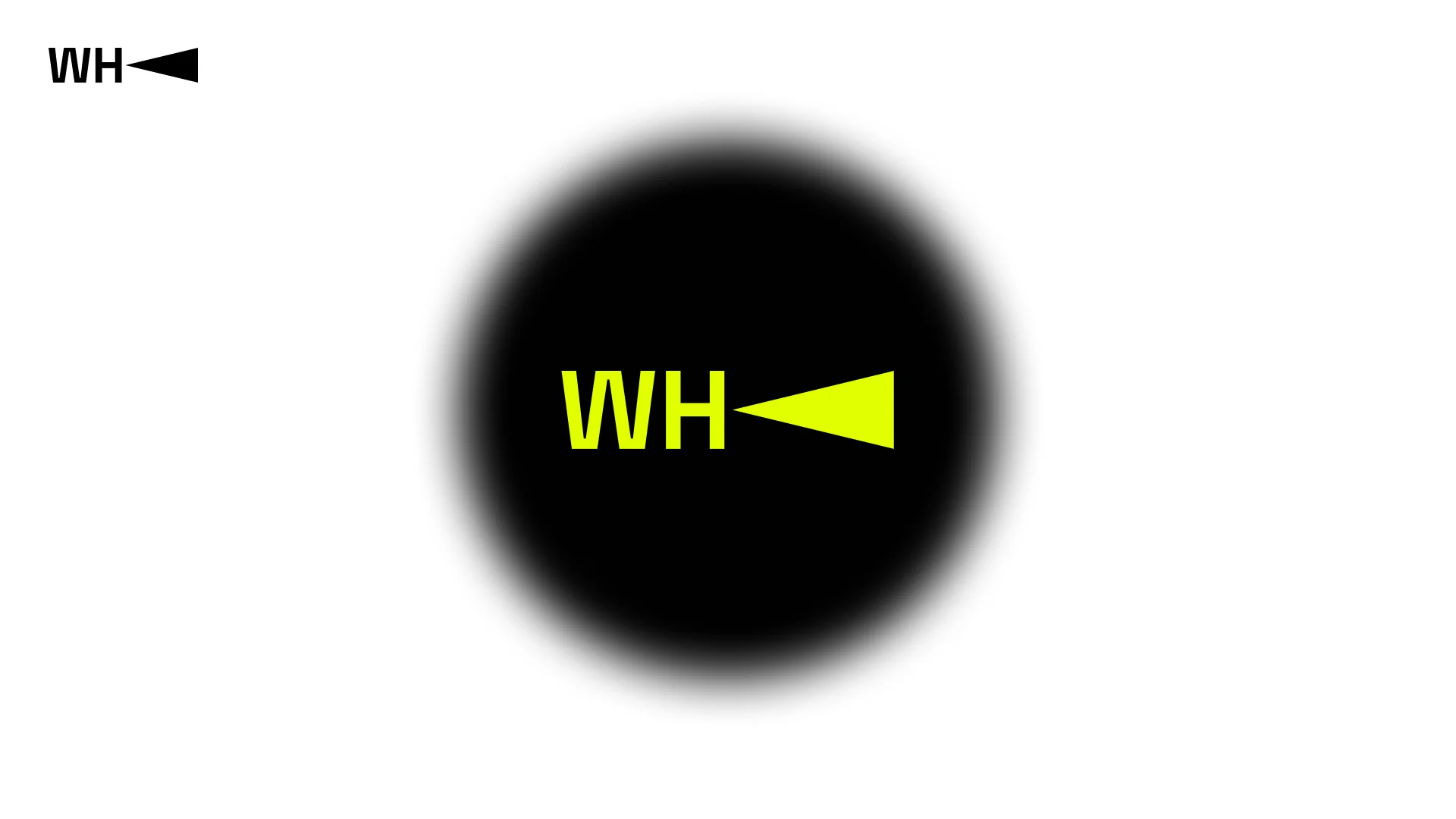
Colors of WePlay Holding. Credit: WePlay Holding
Rebranding is a boost for a company and a way to renew its sense of purpose. In an ever-changing market, a strong brand identity helps a company succeed. WePlay Holding made a step to follow the audience’s ongoing and growing needs and become better with each day. Stay tuned to keep up with all WePlay Holding’s updates.